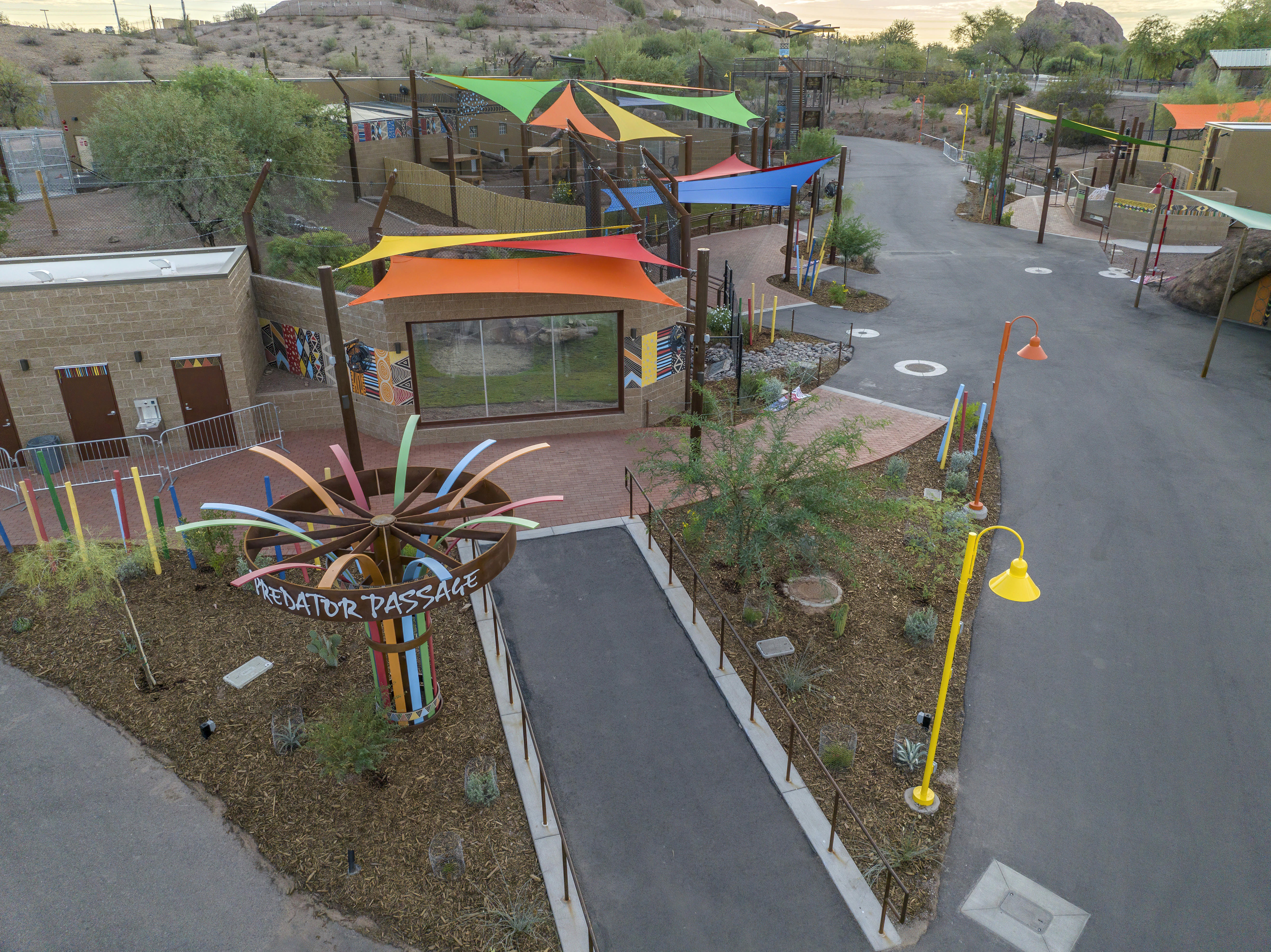
Predator Passage
Collaborators:
Alonso López, Creative Direction and Design
WDM Architects,
Exhibit Design and Construction
Expanding a trail at the Phoenix Zoo
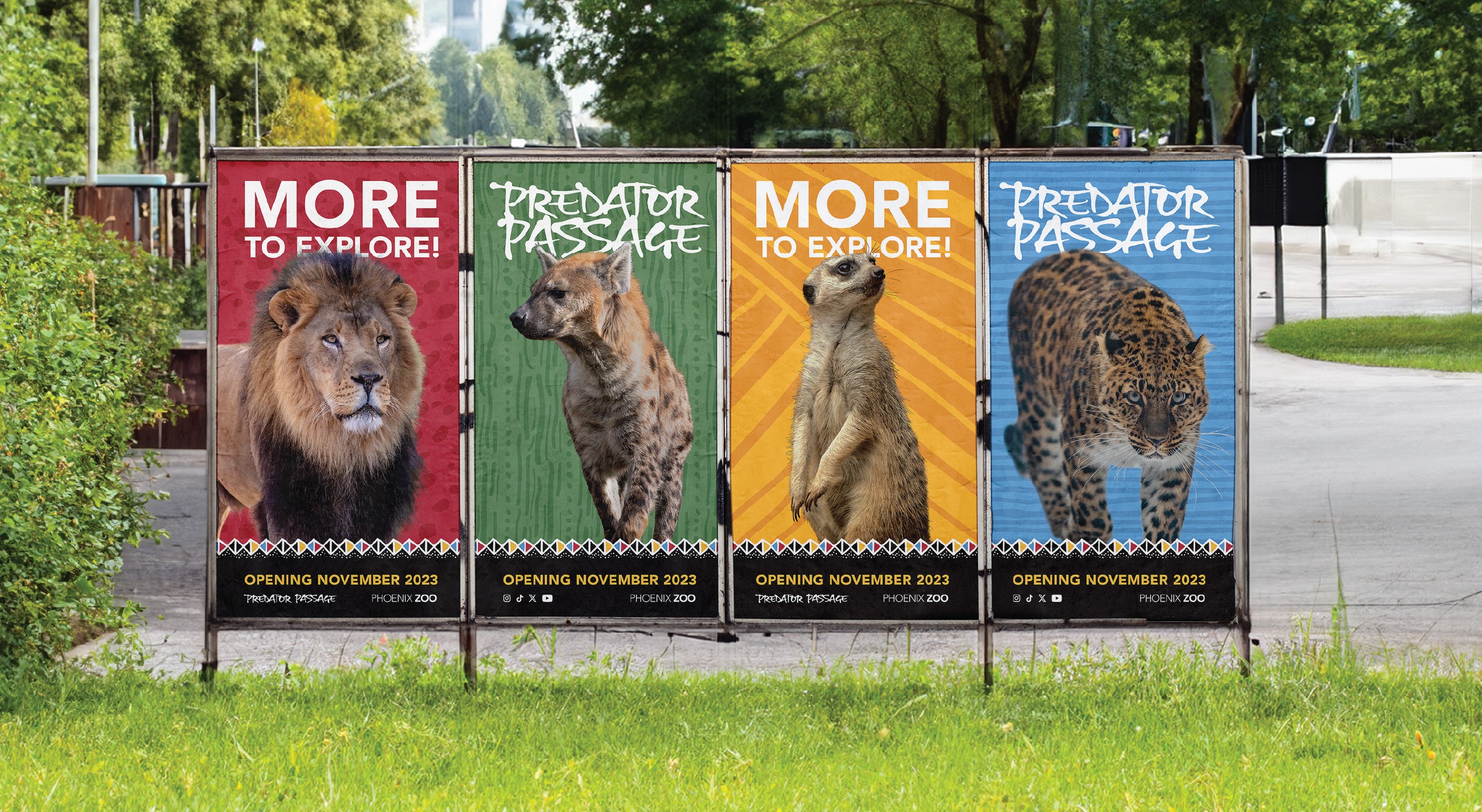
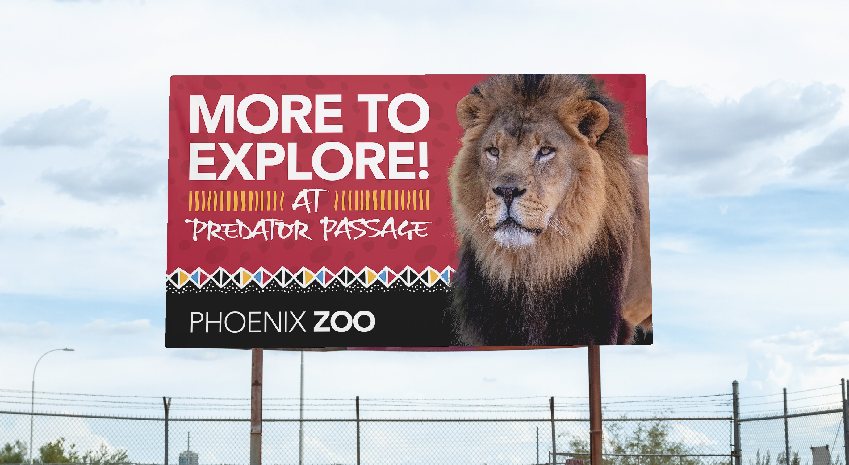
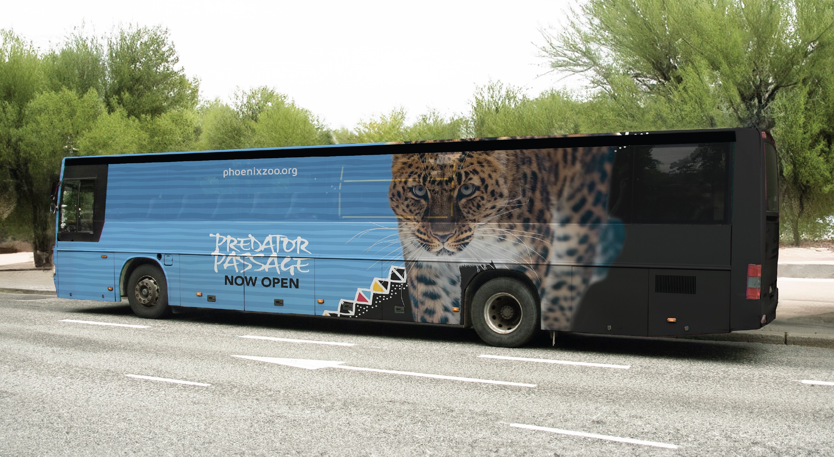
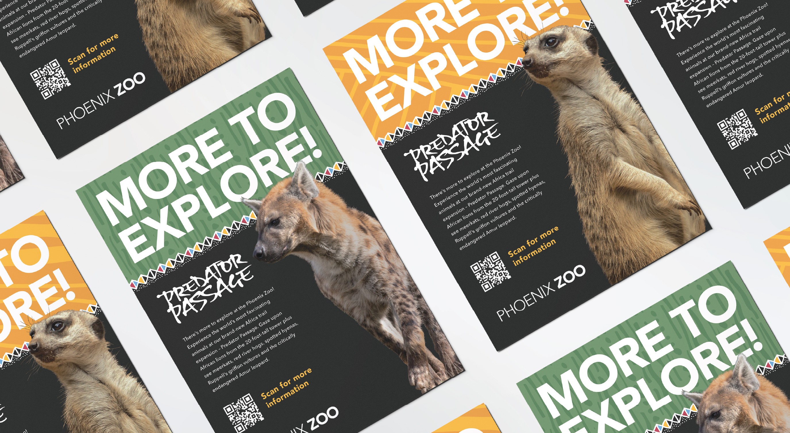
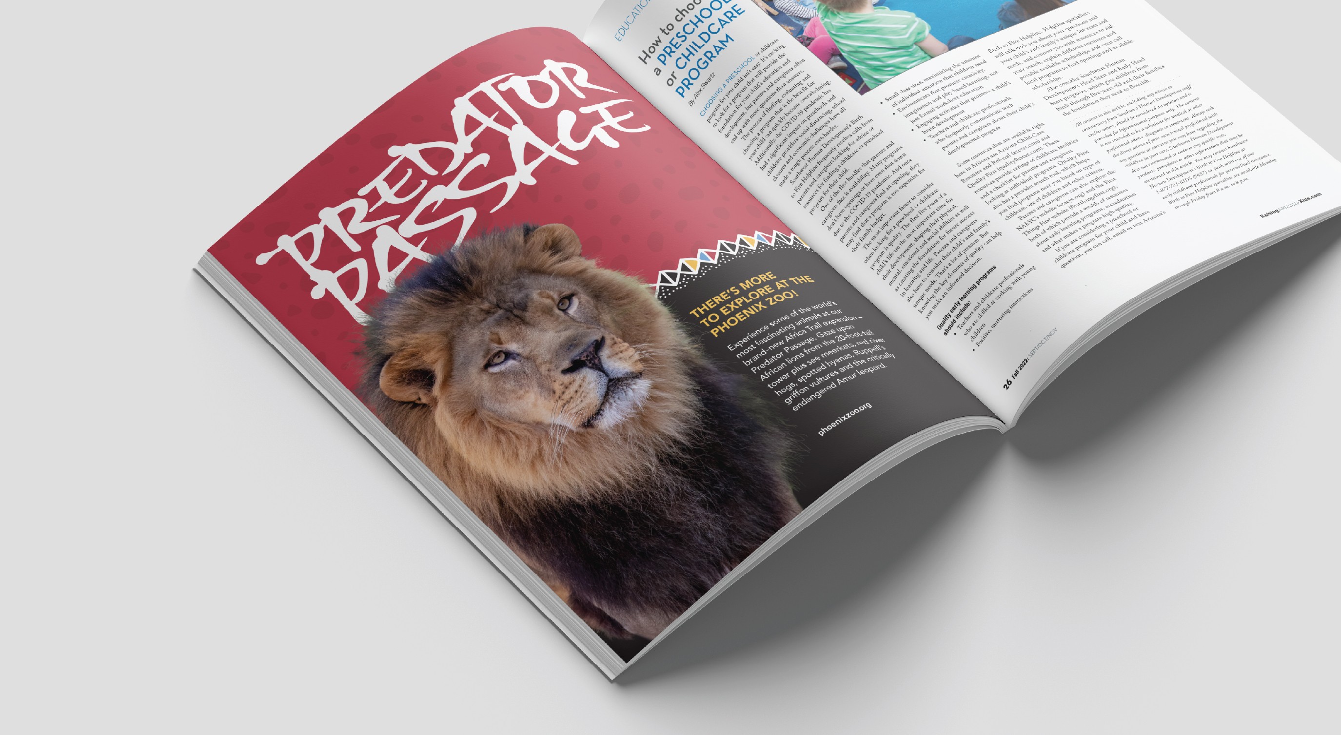
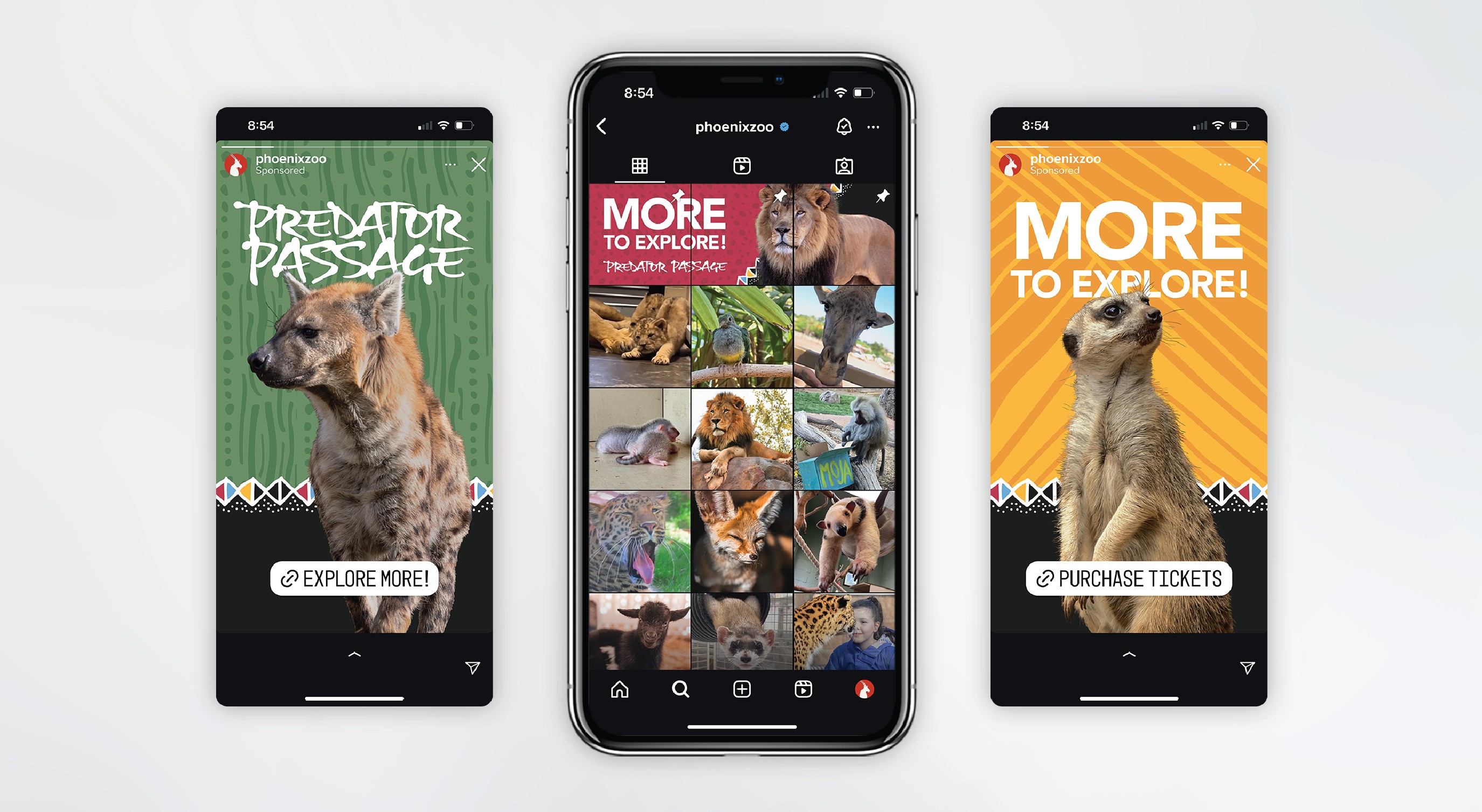
In the summer and fall of 2023 the Africa Trail at the Phoenix Zoo was being expanded. We were presented with the challenge of designing around the visuals the architects implemented in the new expansion. We studied the exhibit's architecture and crafted an identity for an ad campaign based on the patterns and colors throughout the expansion, including the typeface that was built into the sculpture at the entrance.
Our intention was to build out a highly visual, typographic solution using the "More to Explore" tagline composed by the Zoo's marketing team.
Identity
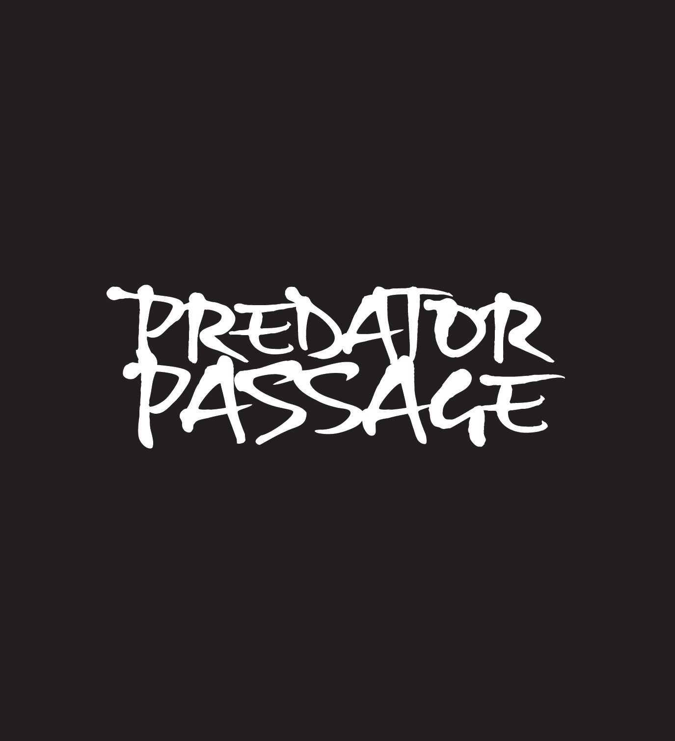
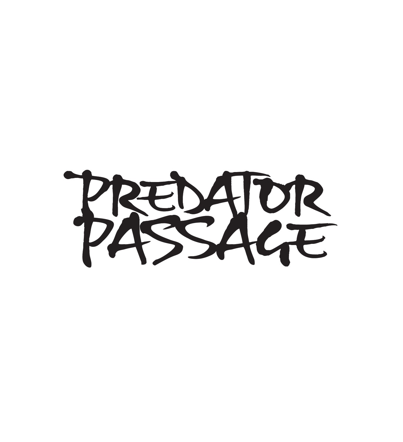
For the campaign, the logo was built based on the sculpture at the entrance to the trail. The architect's incorporated Gizmo in all-caps at the top of the sculpture and a modified version was designed for use on promotional materials.
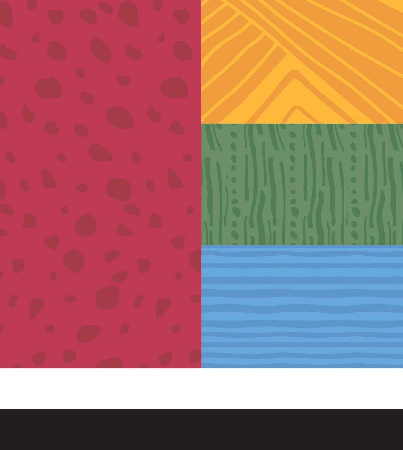
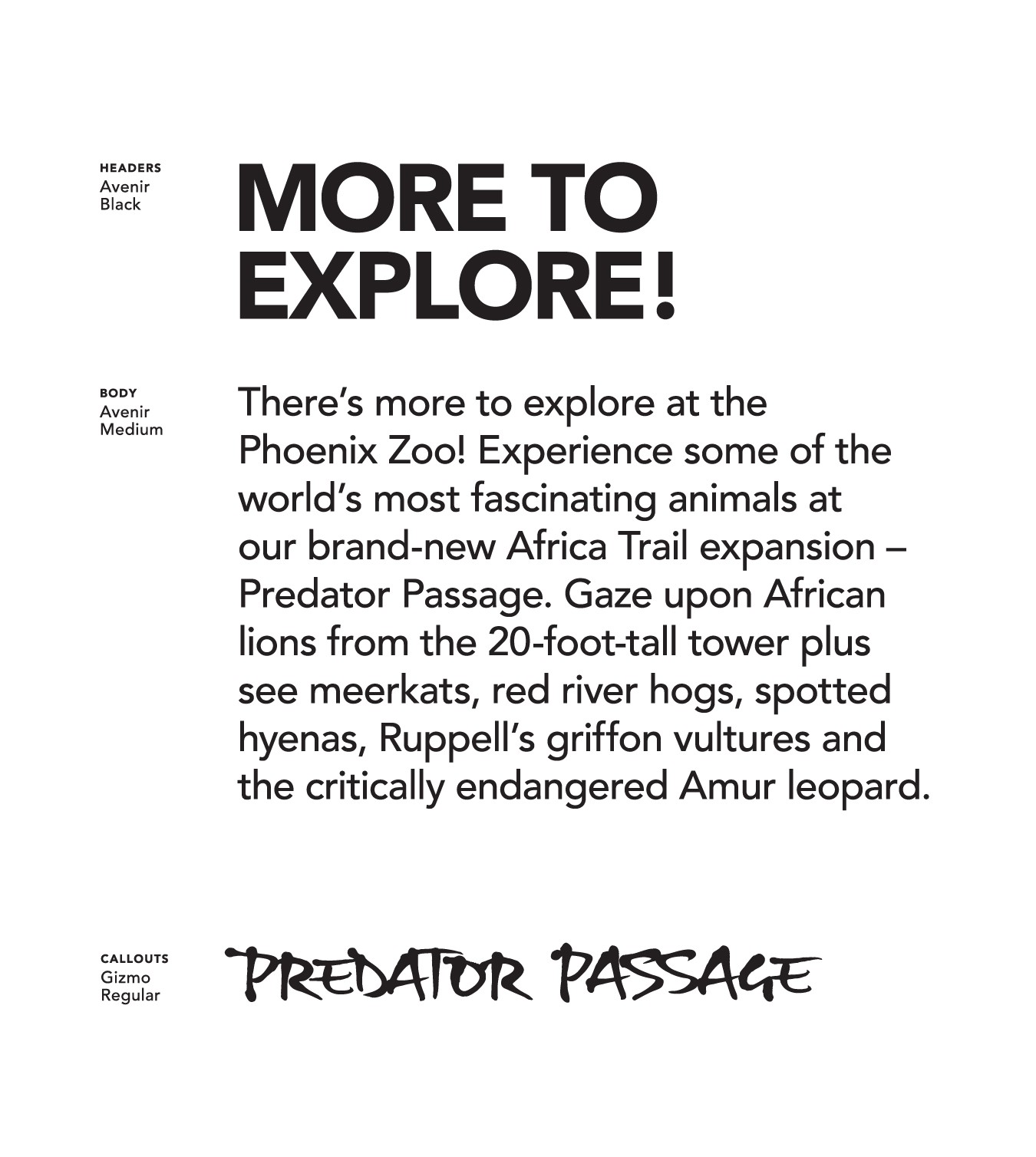
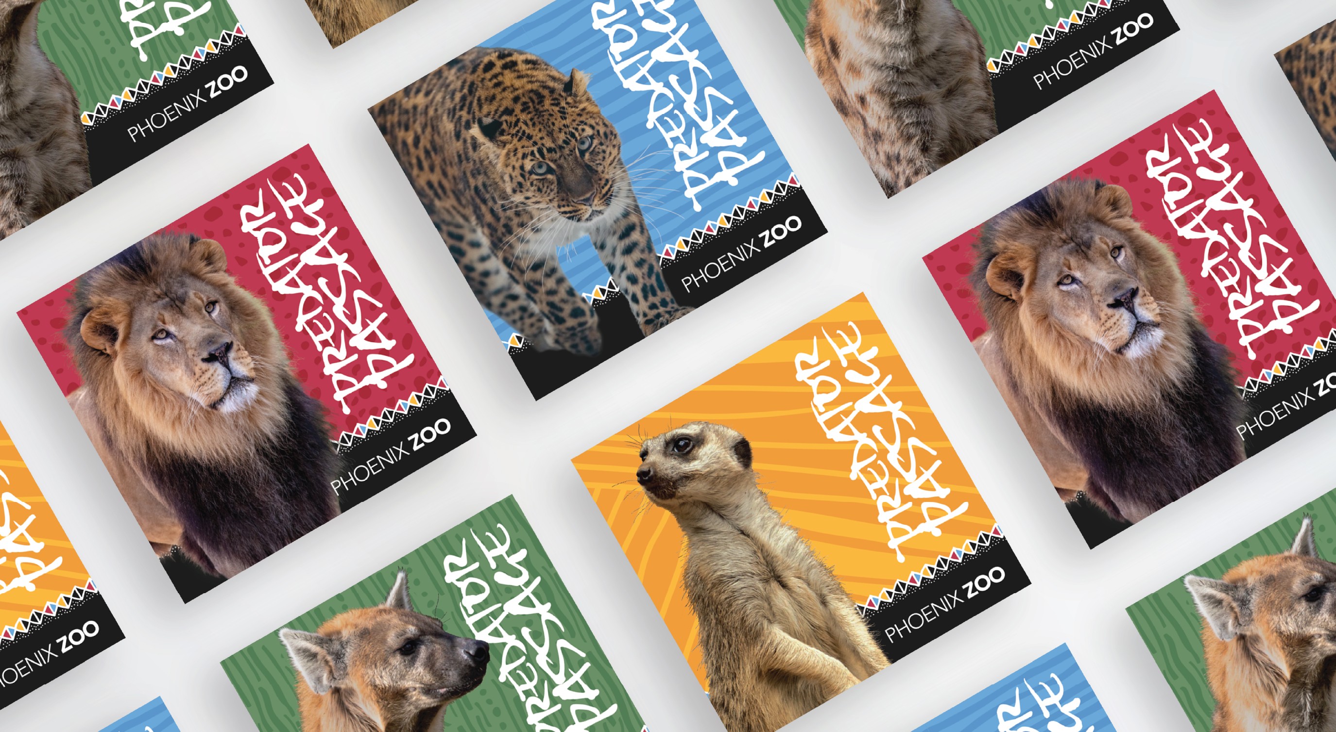
The patterns and colors for the identity were then pulled from photographs of the trail and vectorized and paired with cut-out animals to build out the system. In addition, we pulled our brand approved font, Avenir, to work with the bold messaging.
Marketing
Once the campaign's identity was established it was applied across various deliverables including: on-grounds posters, digital and printed billboards, city bus wraps, flyers, magazine ads, and social media stories and posts.
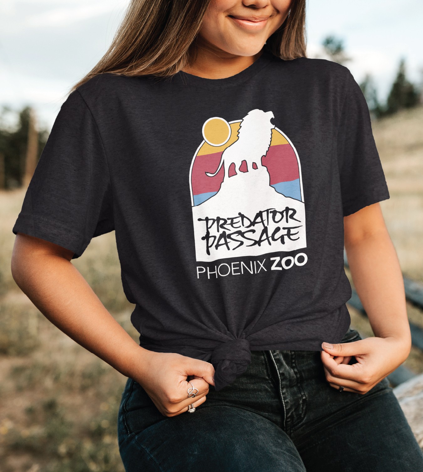
With grand-opening of the trail, limited edition t-shirts and stickers were also released and sold in the Phoenix Zoo Gift Shop.

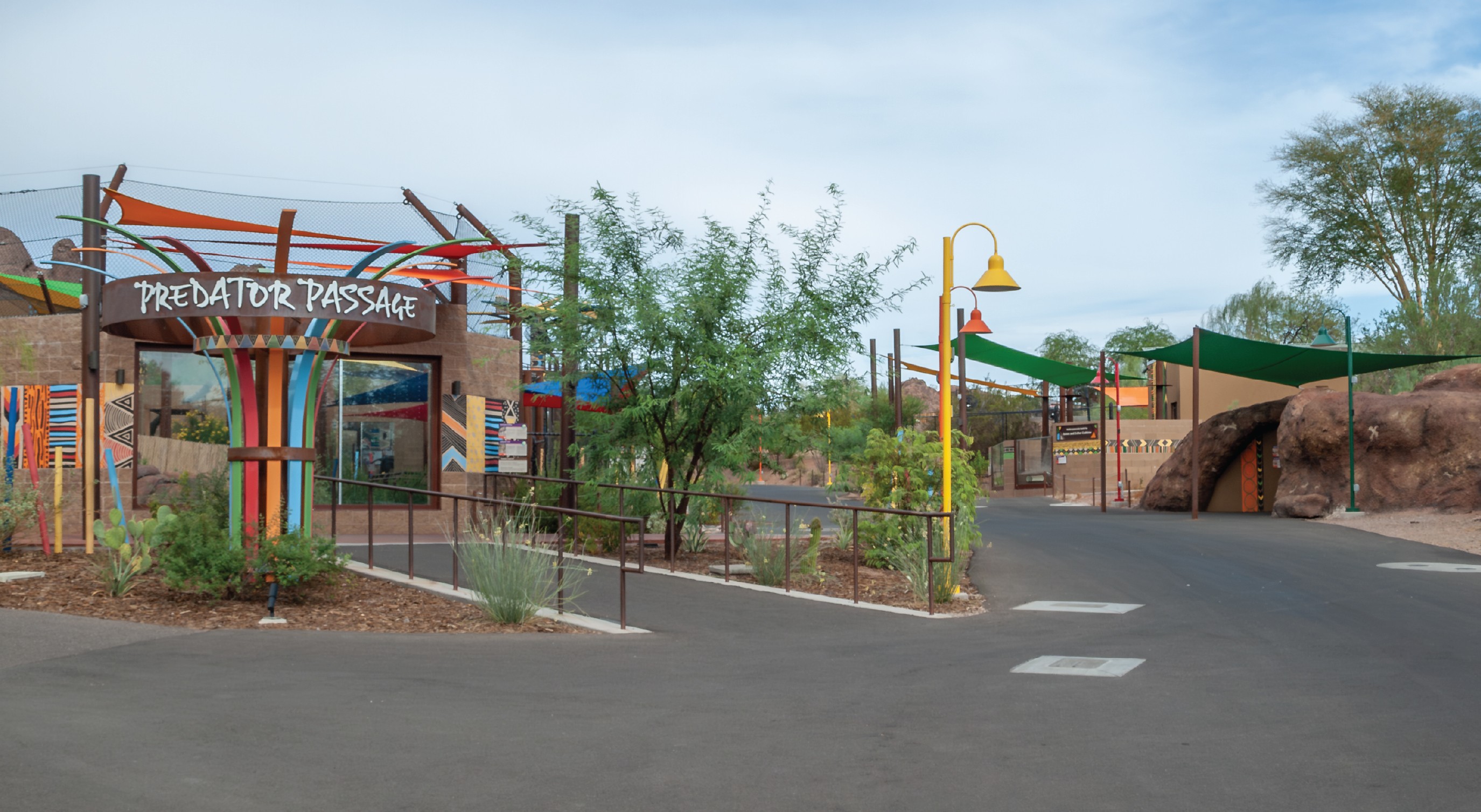
Predator Passage
Expanding a trail at the Phoenix Zoo
In the summer and fall of 2023 the Africa Trail at the Phoenix Zoo was being expanded. We were presented with the challenge of designing around the visuals the architects implemented in the new expansion. We studied the exhibit's architecture and crafted an identity for an ad campaign based on the patterns and colors throughout the expansion, including the typeface that was built into the sculpture at the entrance.
Our intention was to build out a highly visual, typographic solution using the "More to Explore" tagline composed by the Zoo's marketing team.
Collaborators:
Alonso López, Creative Direction and Design
WDM Architects,
Exhibit Design and Construction
Identity
For the campaign, the logo was built based on the sculpture at the entrance to the trail. The architect's incorporated Gizmo in all-caps at the top of the sculpture and a modified version was designed for use on promotional materials.
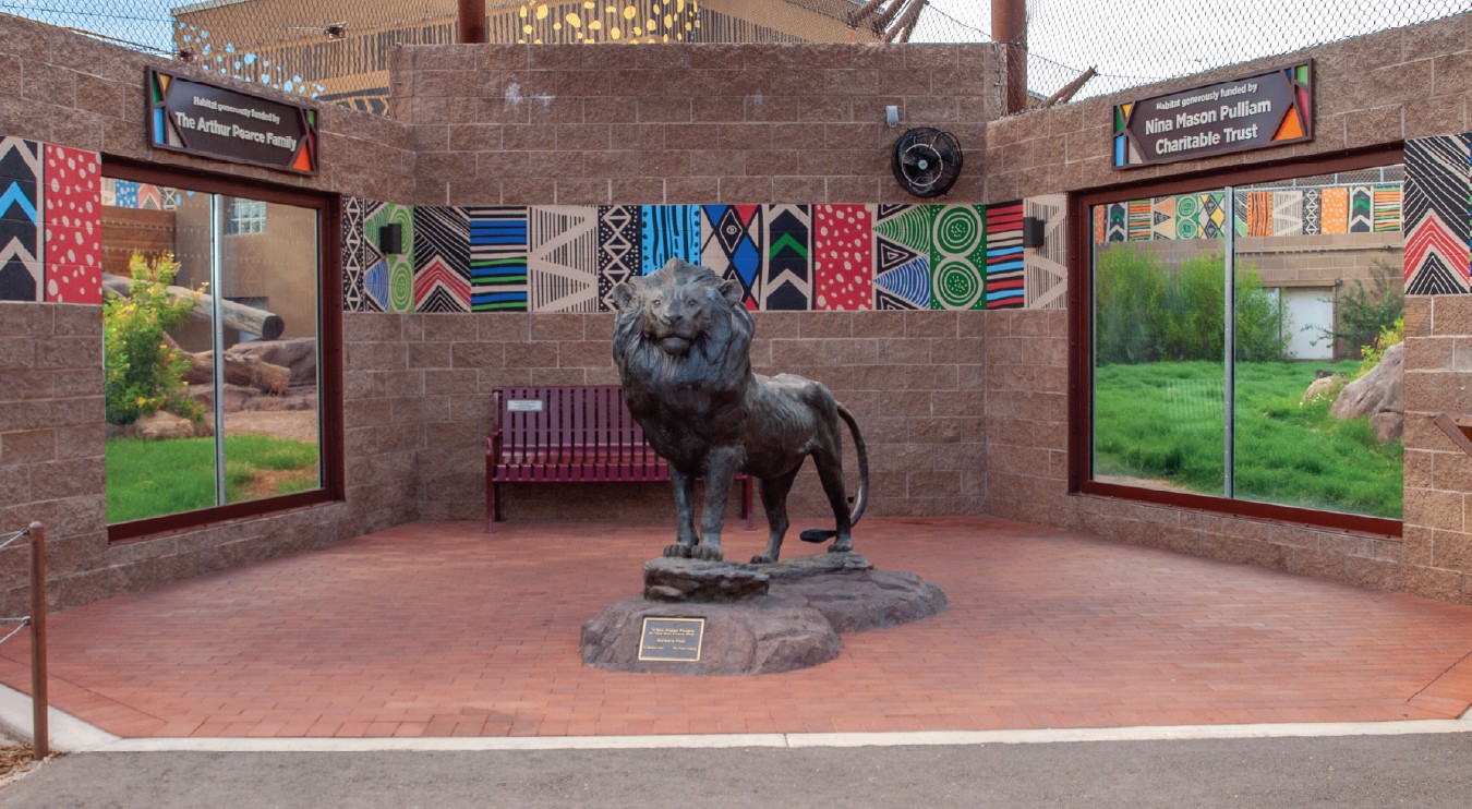
The patterns and colors for the identity were then pulled from photographs of the trail and vectorized and paired with cut-out animals to build out the system. In addition, we pulled our brand approved font, Avenir, to work with the bold messaging.
Marketing
Once the campaign's identity was established it was applied across various deliverables including: on-grounds posters, digital and printed billboards, city bus wraps, flyers, magazine ads, and social media stories and posts.
With grand-opening of the trail, limited edition t-shirts and stickers were also released and sold in the Phoenix Zoo Gift Shop.
Predator Passage
Collaborators:
Alonso López, Creative Direction and Design
WDM Architects,
Exhibit Design and Construction
Expanding a trail at the Phoenix Zoo
In the summer and fall of 2023 the Africa Trail at the Phoenix Zoo was being expanded. We were presented with the challenge of designing around the visuals the architects implemented in the new expansion. We studied the exhibit's architecture and crafted an identity for an ad campaign based on the patterns and colors throughout the expansion, including the typeface that was built into the sculpture at the entrance.
Our intention was to build out a highly visual, typographic solution using the "More to Explore" tagline composed by the Zoo's marketing team.
Identity
For the campaign, the logo was built based on the sculpture at the entrance to the trail. The architect's incorporated Gizmo in all-caps at the top of the sculpture and a modified version was designed for use on promotional materials.
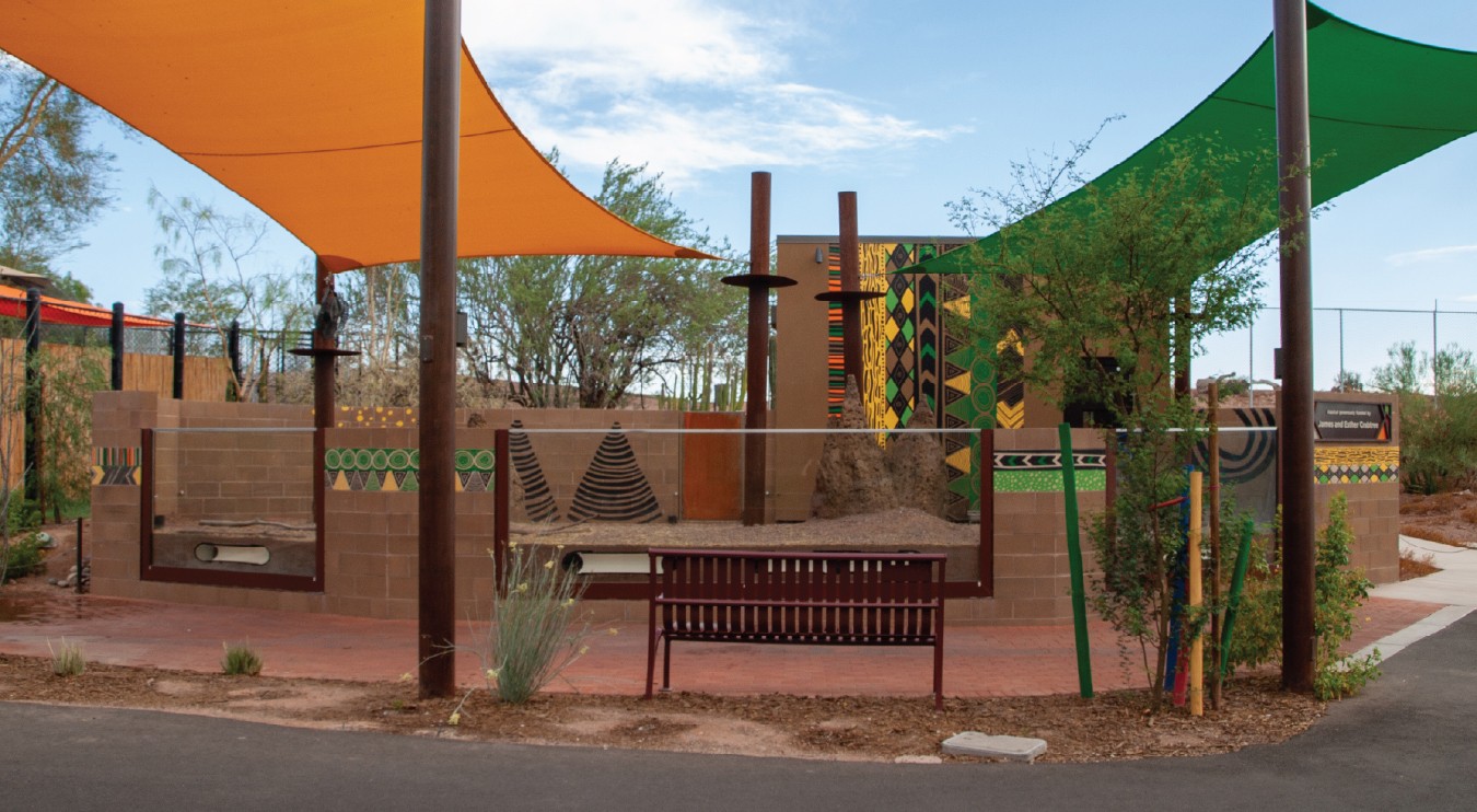
The patterns and colors for the identity were then pulled from photographs of the trail and vectorized and paired with cut-out animals to build out the system. In addition, we pulled our brand approved font, Avenir, to work with the bold messaging.
Marketing
Once the campaign's identity was established it was applied across various deliverables including: on-grounds posters, digital and printed billboards, city bus wraps, flyers, magazine ads, and social media stories and posts.
With grand-opening of the trail, limited edition t-shirts and stickers were also released and sold in the Phoenix Zoo Gift Shop.
Predator Passage
Expanding a trail at the Phoenix Zoo
In the summer and fall of 2023 the Africa Trail at the Phoenix Zoo was being expanded. We were presented with the challenge of designing around the visuals the architects implemented in the new expansion. We studied the exhibit's architecture and crafted an identity for an ad campaign based on the patterns and colors throughout the expansion, including the typeface that was built into the sculpture at the entrance.
Our intention was to build out a highly visual, typographic solution using the "More to Explore" tagline composed by the Zoo's marketing team.
Collaborators:
Alonso López, Creative Direction and Design
WDM Architects,
Exhibit Design and Construction
Identity
For the campaign, the logo was built based on the sculpture at the entrance to the trail. The architect's incorporated Gizmo in all-caps at the top of the sculpture and a modified version was designed for use on promotional materials.
The patterns and colors for the identity were then pulled from photographs of the trail and vectorized and paired with cut-out animals to build out the system. In addition, we pulled our brand approved font, Avenir, to work with the bold messaging.
Marketing
Once the campaign's identity was established it was applied across various deliverables including: on-grounds posters, digital and printed billboards, city bus wraps, flyers, magazine ads, and social media stories and posts.
With grand-opening of the trail, limited edition t-shirts and stickers were also released and sold in the Phoenix Zoo Gift Shop.
Predator Passage
Collaborators:
Alonso López, Creative Direction and Design
WDM Architects,
Exhibit Design and Construction
Expanding a trail at the Phoenix Zoo
In the summer and fall of 2023 the Africa Trail at the Phoenix Zoo was being expanded. We were presented with the challenge of designing around the visuals the architects implemented in the new expansion. We studied the exhibit's architecture and crafted an identity for an ad campaign based on the patterns and colors throughout the expansion, including the typeface that was built into the sculpture at the entrance.
Our intention was to build out a highly visual, typographic solution using the "More to Explore" tagline composed by the Zoo's marketing team.
Identity
For the campaign, the logo was built based on the sculpture at the entrance to the trail. The architect's incorporated Gizmo in all-caps at the top of the sculpture and a modified version was designed for use on promotional materials.
The patterns and colors for the identity were then pulled from photographs of the trail and vectorized and paired with cut-out animals to build out the system. In addition, we pulled our brand approved font, Avenir, to work with the bold messaging.
Marketing
Once the campaign's identity was established it was applied across various deliverables including: on-grounds posters, digital and printed billboards, city bus wraps, flyers, magazine ads, and social media stories and posts.
With grand-opening of the trail, limited edition t-shirts and stickers were also released and sold in the Phoenix Zoo Gift Shop.
Predator Passage
Expanding a trail at the Phoenix Zoo
In the summer and fall of 2023 the Africa Trail at the Phoenix Zoo was being expanded. We were presented with the challenge of designing around the visuals the architects implemented in the new expansion. We studied the exhibit's architecture and crafted an identity for an ad campaign based on the patterns and colors throughout the expansion, including the typeface that was built into the sculpture at the entrance.
Our intention was to build out a highly visual, typographic solution using the "More to Explore" tagline composed by the Zoo's marketing team.
Collaborators:
Alonso López, Creative Direction and Design
WDM Architects,
Exhibit Design and Construction
Identity
For the campaign, the logo was built based on the sculpture at the entrance to the trail. The architect's incorporated Gizmo in all-caps at the top of the sculpture and a modified version was designed for use on promotional materials.
The patterns and colors for the identity were then pulled from photographs of the trail and vectorized and paired with cut-out animals to build out the system. In addition, we pulled our brand approved font, Avenir, to work with the bold messaging.
Marketing
Once the campaign's identity was established it was applied across various deliverables including: on-grounds posters, digital and printed billboards, city bus wraps, flyers, magazine ads, and social media stories and posts.
With grand-opening of the trail, limited edition t-shirts and stickers were also released and sold in the Phoenix Zoo Gift Shop.
Predator Passage
Collaborators:
Alonso López, Creative Direction and Design
WDM Architects,
Exhibit Design and Construction
Expanding a trail at the Phoenix Zoo
In the summer and fall of 2023 the Africa Trail at the Phoenix Zoo was being expanded. We were presented with the challenge of designing around the visuals the architects implemented in the new expansion. We studied the exhibit's architecture and crafted an identity for an ad campaign based on the patterns and colors throughout the expansion, including the typeface that was built into the sculpture at the entrance.
Our intention was to build out a highly visual, typographic solution using the "More to Explore" tagline composed by the Zoo's marketing team.
Identity
For the campaign, the logo was built based on the sculpture at the entrance to the trail. The architect's incorporated Gizmo in all-caps at the top of the sculpture and a modified version was designed for use on promotional materials.
The patterns and colors for the identity were then pulled from photographs of the trail and vectorized and paired with cut-out animals to build out the system. In addition, we pulled our brand approved font, Avenir, to work with the bold messaging.
Marketing
Once the campaign's identity was established it was applied across various deliverables including: on-grounds posters, digital and printed billboards, city bus wraps, flyers, magazine ads, and social media stories and posts.
With grand-opening of the trail, limited edition t-shirts and stickers were also released and sold in the Phoenix Zoo Gift Shop.